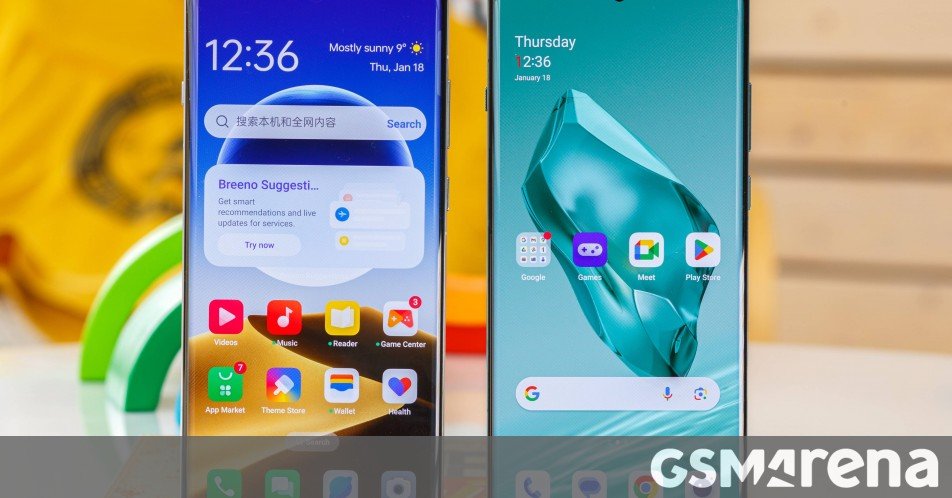
Even though Oppo, Realme and OnePlus call their proprietary Android skins with different names, the three UIs look and feel the same and offer the same set of features and pretty much the same user experience, much to the disappointment of long-time OnePlus users who still mourn some of Oxygen OS’s proprietary features.
Still, regardless of which one of the three brands your phone comes from, you will enjoy a largely smooth and feature-rich experience.
Compared to the older ColorOS 13/OxygenOS 13/Realme UI 4.0, the new Android 14-based ColorOS 14/OxygenOS 14/Realme UI 5.0 versions offer few user-facing changes. We’ll cover those as we go.
Lock screen, home screen, Always-on display
You’d feel right at home if you’ve ever used one of the three operating systems. There are no notable changes to how you navigate or how the UI looks. You get a standard app drawer by default and a familiar notification shade with quick toggles.
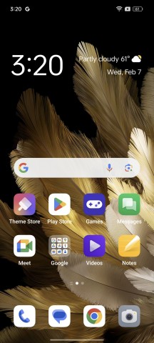
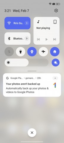
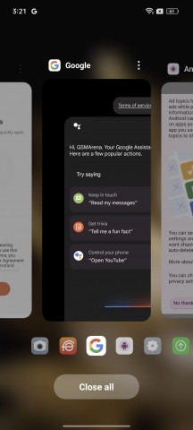
Home screen • Notification shade • Recent apps menu
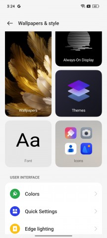
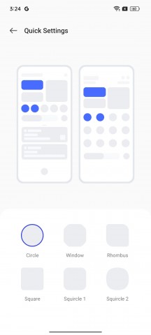
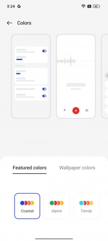
Many of the UI elements are customizable – fonts, icons, accent colors and even the shape of the quick toggles in the notification shade.
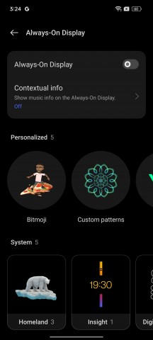
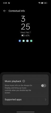
The Always-on display function offers a wide variety of customizations as well.
A well-known feature by this point is the ability to launch an app by holding down the fingerprint reader when unlocking. A pop-up menu with apps of your choice opens up. Oppo/OnePlus/Realme pioneered this feature, and we are happy to see it still around.
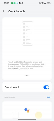
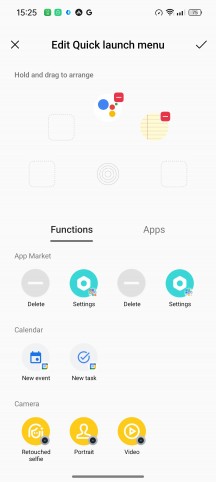
Quick Launch fingerprint feature
Gestures and navigation
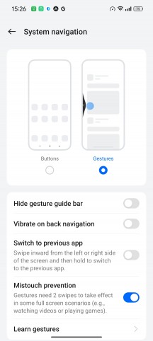
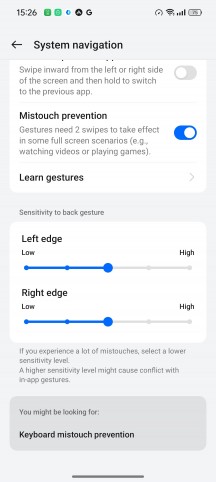
Navigation is pretty standard – you can choose between gestures and software buttons. The gesture navigation can be tailored to your preference – sensitivity for the back gestures with separate granular control over the left and right edge, hiding the gesture guide bar, etc.
Some additional gestures are also at hand – screen-off gestures to launch apps by drawing letters on a locked screen, lifting the phone to your ear to answer, and auto switching to the earpiece if connected to Bluetooth. On certain Realme/OnePlus/Oppo devices, usually higher-end handsets, you can control the phone from afar with Air gestures.
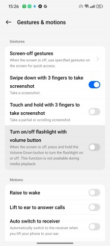
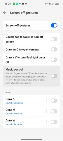
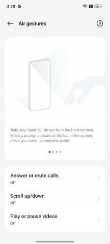
Screen-off gestures and Air gestures
Multitasking and productivity features
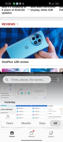
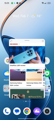
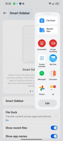
As most Android overlays nowadays, the trio has a handful of features suitable for multitasking. You have the standard Split View (two apps opened on the screen simultaneously), Flexible Window (open apps in interactive small windows, you can keep a handful opened at a time) and Smart Sidebar (select apps and tools of your choice so you can launch them by pulling out the bar from the side edge).
The Sidebar gets a new feature of its own, though. You can now save any type of file to the File Dock and access it anytime. A Recent Files list is also available.
Last but not least, a Smart Touch feature allows you to extract images and text directly from a screenshot, and it appears to be available only on higher-end devices. However, the built-in Google Lens functionality can do that for you, even if your Oppo/Realme/OnePlus phone doesn’t support Smart Touch.
Notifications
Notification features are pretty standard and straightforward, although there are notable exceptions. The Smart notification hiding, for example, is a cool privacy feature available on most Realme/Oppo/OnePlus devices, even on more budget ones. When you enable Face Unlock, the system will use your face’s data to keep your notifications private. For instance, if the front-facing camera catches someone else looking at your phone, it will hide the contents of the notification banner.
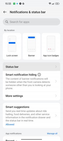
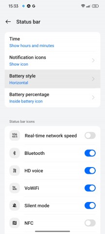
Notification-related features and customizations
Speaking of banners, the system will provide a couple of quick contextual actions for you to choose from directly from the notification in the notification shade.
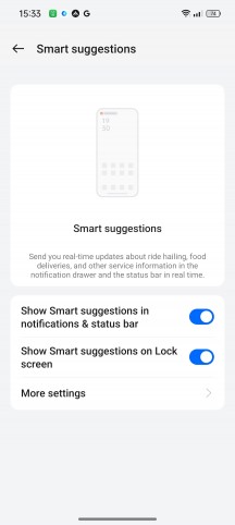
Smart Suggestions are pop-up banners that can also persist in the notification shade as regular notifications. They provide real-time information depending on the situation. For example, it will keep you posted about your food delivery, ride-hailing service, etc. You can also allow them on the lock screen and Always-on display.
Unfortunately, the system doesn’t support smart suggestions from all apps, so your experience may vary.
Similarly to Apple’s Dynamic Island, Oppo has implemented some sort of contextual bubbles. Oppo calls it Aqua Dynamics, and it works with certain system apps, like the recorder. A small bubble shows up on the status bar, indicating that the recorder is active. We couldn’t make it work with the Music app, though, which is unfortunate as it makes the most sense to work with media players.
And in case you are a OnePlus or Oppo Find N3 device owner, you can switch between Ring mode, Vibrate mode and Silent mode on the fly by using the alert slider.
Multi-screen connect
This is hardly a new feature, but it offers an extensive list of things you can do by connecting your PC and phone or another Oppo/Realme/OnePlus device. You can screen cast, share files and multitask. However, we found the connection process to be extremely tedious with multiple sign-ins and issues when connecting a Realme to an Oppo smartphone, and you can’t use it with your desktop PC if it doesn’t have wireless adapters. It’s a weird limitation given that all devices are on the same network. It’s definitely not a straightforward process and it’s far from Samsung’s DeX or Motorola’s Ready For solutions.
Wrap-up
Although smooth and feature-rich, ColorOS/OxygenOS/Realme UI is a bit behind the curve when it comes to implementing the latest Android changes and trendy features. There are little to no changes in the way you can use these three Android overlays and there are no notable new features either. While Samsung and Google are integrating AI-powered features into their own versions of Android 14 and Xiaomi is revamping its MIUI 14 into HyperOS, Oppo, OnePlus, and Realme’s approach is somewhat stale.

